CSS - Natour Part4

Today’s notes is for the Section 5, Lecture 49-53 of this udemy course.

Lecture 49-51
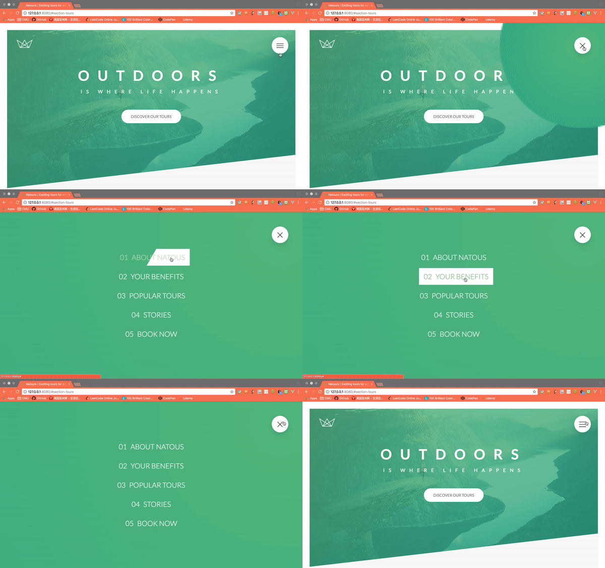
Screenshots

Create a menu button

1
2
3
4
5
6
<div class="navigation">
<input type="checkbox" id="navi-toggle" class="navigation__checkbox">
<label for="navi-toggle" class="navigation__button">
<span class="navigation__icon"></span>
</label>
</div>

Open button

The basic approach is to using a button-like element to perform as the toggle of the menu. Behind the scene, it uses the checkbox input as the event trigger.

1
2
3
4
5
6
7
8
9
10
11
12
13
14
15
16
17
18
19
20
21
22
23
24
25
26
27
28
29
30
31
32
33
34
35
36
37
38
39
40
41
42
43
44
45
46
47
48
49
50
.navigation {

&__checkbox {
display: none; // don't show the actual checkbox input
}

&__button {
position: fixed; // to set the button at fixed position of the screen. won't scroll with the page
width: 7rem;
height: 7rem;
top: 6rem;
left: 6rem;
border-radius: 50%;
cursor: pointer;
background-color: $color-white;
text-align: center;
z-index: 2000; // to place the button always on top of other things
box-shadow: 0 2rem 3rem rgba($color-black, .1); // x y blur color
}

&__icon {

position: relative; // to let the before and after be placed according to the icon itself
margin-top: 3.5rem;

&,
&::before,
&::after {
width: 4rem;
height: 2px;
backgroud-color: $color-grey-dark;
display: inline-block; // otherwise it will be inline element, can't be aligned properly.
} // get the shape of the rectangle

&::before,
&::after {
content: "";
position: absolute;
left: 0; // align to the left
}

&::before {
top: -0.8rem; // above the central one
}

&::after {
top: 0.8rem; // below the central one
}
}
}

Change open button into close button

The approach is to make the navigation__icon itself disappear, then rotate the before and after elements.

1
2
3
4
5
6
7
8
9
10
11
12
13
14
15
16
.navigation {

&__checkbox:checked + &__button &__icon {
background-color: transparent; // if use display:none or change the width / height, the before and after will be changed accordingly.
} // when the checkbox is checked, modify the &__icon element inside of the &__button sibline element

&__checkbox:checked + &__button &__icon::before {
top: 0;
transform: rotate(135deg);
}

&__checkbox:checked + &__button &__icon::before {
top: 0;
transform: rotate(-135deg);
}
}
1
2
3
4
5
6
7
8
9
10
<div class="navigation__background">&nbsp;</div>
<nav class="navigation__nav">
<ul class="navigation__list">
<li class="navigation__item"><a href="#" class="navigation__link"><span>01</span>About Natous</a></li>
<li class="navigation__item"><a href="#" class="navigation__link"><span>02</span>Your benefits</a></li>
<li class="navigation__item"><a href="#" class="navigation__link"><span>03</span>Popular tours</a></li>
<li class="navigation__item"><a href="#" class="navigation__link"><span>04</span>Stories</a></li>
<li class="navigation__item"><a href="#" class="navigation__link"><span>05</span>Book now</a></li>
</ul>
</nav>

Expand the background to the full screen

The background is initially a circle shage hiding behind the button, when the checkbox is checked which means the background should be expanded out, increase the size.

1
2
3
4
5
6
7
8
9
10
11
12
13
14
15
16
17
.navigation {
&__background {
position: fixed;
width: 6rem; // slightly smaller than the button
height: 6rem;
top: 6.5rem;
left: 6.5rem;
border-radius: 50%;
background-image: radial-gradient($color-primary-light, $color-primary-dark); // gradient from central point
z-index: 1000;
transition: transform .8s cubic-bezier(0.86, 0, 0.07, 1); // cubic-bezier function used for customized animation effect
}

&__checkbox:checked ~ &__background {
transform: scale(80); // enlarge the background to cover the full screen
}
}

Display the menu

Set the menu invisible when the checkbox unchecked.

1
2
3
4
5
6
7
8
9
10
11
12
13
14
15
16
17
18
19
20
21
22
23
24
25
26
27
28
29
.navigation {
&__nav {
height: 100vh;
position: absolute;
top: 0;
left: 0;
z-index: 1500; // under the button, above the background
transition: all .8s cubic-bezier(0.68,-0.55, 0.265, 1.55);
// initially set the nav to invisible
width: 0;
opacity: 0;
}

&__checkbox:checked ~ &__nav {
width: 100%;
opacity: 1;
}

&__list {
position: absolute;
// typical function to center align horizontally and vertically an element
left: 50%;
top: 50%;
transform: translate(-50%, -50%);
list-style: none;
text-align: center;
width: 100%;
}
}

List item styling

The hover background effect: Have a bigger background with half transparent and half width, with the sepration skewed. Then move the background from one side to another to create the effect of the white color moving in from the side when hovered.

1
2
3
4
5
6
7
8
9
10
11
12
13
14
15
16
17
18
19
20
21
22
23
24
25
26
27
28
29
30
31
32
33
34
35
36
.navigation {
&__item {
margin: 1rem;
}

&__link {
&:link,
&:visited {
display: inline-block;
font-size: 3rem;
font-weight: 300;
padding: 1rem 2rem;
color: $color-white;
text-decoration: none;
text-transform: uppercase;
background-image: linear-gradient(
120deg,
transparent 0%,
transparent 50%,
$color-white 50%
); // create the half transparent half white background
background-size: 230%; // to make it initially with only the transparent half, then move to white half
transition: all .4s ease;

span {
margin-right: 1.5rem;
}
}
&:hover,
&:active {
background-position: 100%; // move to the other end
color: $color-primary;
transform: translateX(1rem); // move to the right a little bit
}
}
}

Lecture 52-53

Screenshots

1
2
3
4
5
6
7
8
9
10
11
12
13
14
15
16
17
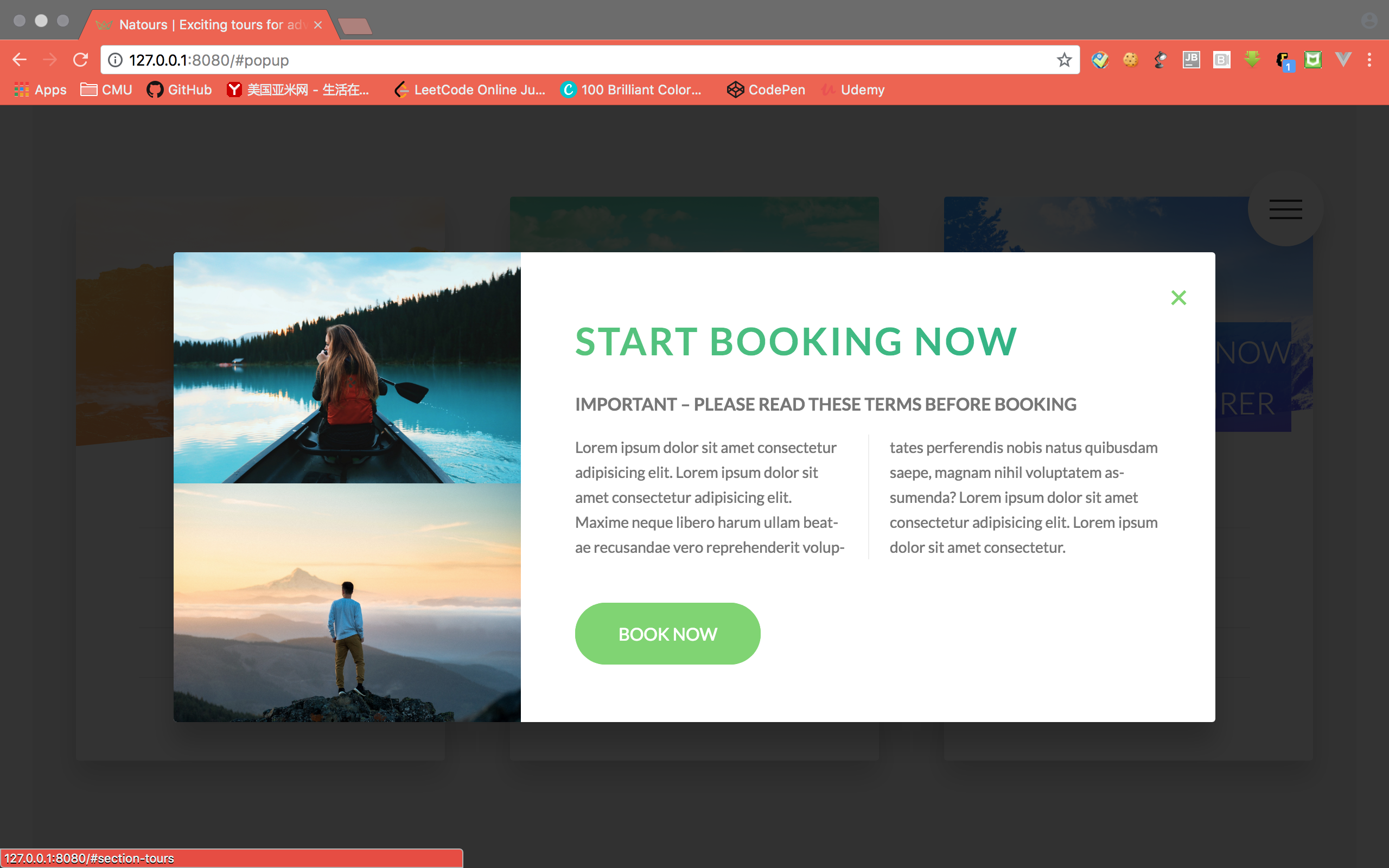
<div id="popup" class="popup">
<div class="popup__content">
<div class="popup__left">
<img src="img/nat-8.jpg" alt="Tour photo" class="popup__img">
<img src="img/nat-9.jpg" alt="Tour photo" class="popup__img">
</div>
<div class="popup__right">
<a href="#section-tours" class="popup__close">&times;</a>
<h2 class="heading-secondary u-margin-bottom-small">Start booking now</h2>
<h3 class="heading-tertiary u-margin-bottom-small">Important &ndash; Please read these terms before booking</h3>
<p class="popup__text">
Lorem ipsum dolor sit amet consectetur adipisicing elit. Lorem ipsum dolor sit amet consectetur adipisicing elit. Maxime neque libero harum ullam beatae recusandae vero reprehenderit voluptates perferendis nobis natus quibusdam saepe, magnam nihil voluptatem assumenda? Lorem ipsum dolor sit amet consectetur adipisicing elit. Lorem ipsum dolor sit amet consectetur.
</p>
<a href="#" class="btn btn--green">Book now</a>
</div>
</div>
</div>

Create the Pop up

The pop up should be at the fixed position on the screen, but won’t show up before been triggered.
Point layout: column for text, hyphen for word, left right sections with same height using display table-cell.

1
2
3
4
5
6
7
8
9
10
11
12
13
14
15
16
17
18
19
20
21
22
23
24
25
26
27
28
29
30
31
32
33
34
35
36
37
38
39
40
41
42
43
44
45
46
47
48
49
50
51
52
53
54
55
56
57
58
59
60
61
62
.popup {
background-color: rgba($color-black, .8);
width: 100%;
height: 100vh;
position: fixed;
top: 0;
left: 0;
z-index: 5000;
// hidden initially
opacity: 0;
visibility: hidden;
transition: all 0.3s;

&__content {
@include absCenter;
width: 75%;
// height: 50rem;
border-radius: 3px;
background-color: $color-white;
box-shadow: 0 2rem 4rem rgba($color-black, .2);
display: table; // for the table-cell display children elements
overflow: hidden;
opacity: 0;
transform: translate(-50%, -50%) scale(.5);
transition: all .5s .25s;
}

&__left {
width: 33.3333%;
display: table-cell;
vertical-align: middle; // works for table-cell display layout
}

&__right {
width: 66.6667%;
display: table-cell;
vertical-align: middle;
padding: 3rem 5rem;
}

&__img {
display: block;
width: 100%;
}

&__text {
font-size: 1.4rem;
margin-bottom: 4rem;

-moz-column-count: 2;
-moz-column-gap: 4rem;
-moz-column-rule: 1px solid $color-grey-light-2;
column-count: 2; // separate into 2 columns
column-gap: 4rem; // the gap between columns
column-rule: 1px solid $color-grey-light-2;

-moz-hyphens: auto;
-ms-hyphens: auto;
-webkit-hyphens: auto;
hyphens: auto;
}
}

Using link href to link to the specific element with the id.

1
<a href="#popup" class="btn btn--white">Book now!</a>

When the element itself is triggered by id, we can use the target psedo class to manipulate the css.

1
2
3
4
5
6
7
8
9
10
11
.popup {
&:target {
opacity: 1;
visibility: visible;
}

&:target &__content {
opacity: 1;
transform: translate(-50%, -50%) scale(1);
}
}