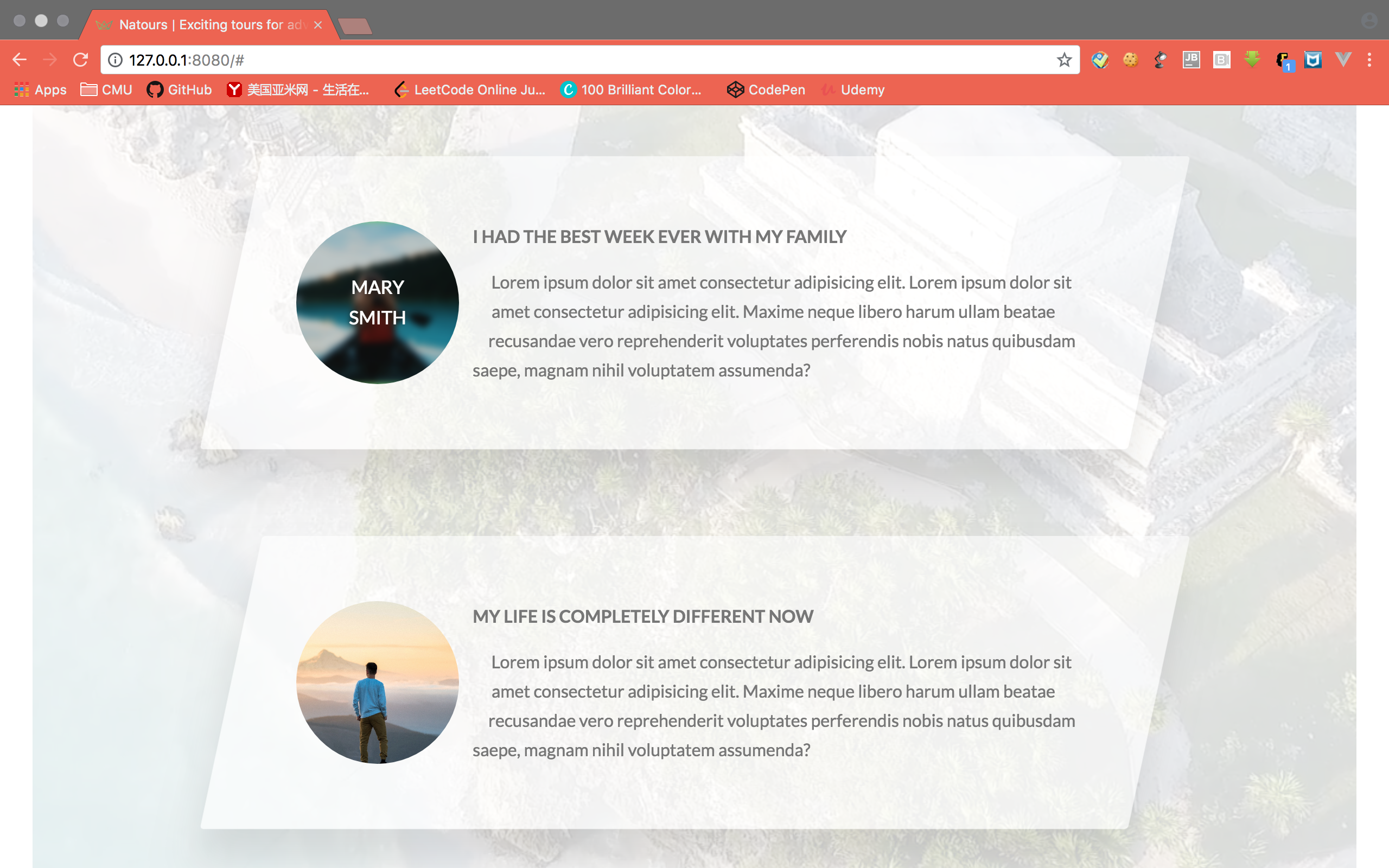
Today’s notes is for the Section 5, Lecture 42-47 of this udemy course.
Lecture 42-44

How to create a circled picture
First we define how the element outside will align with the element. In this case, the text on the right hand side.1
2
3
4
5
6
7.story__shape {
float: left;
width: 5rem;
height: 5rem;
-webkit-shape-outside: circle(50% at 50% 50%); // diameter, circle center point
shape-outside: circle(50% at 50% 50%); //only work if the element is floating and have dimensions set.
}
Then we circle the element itself.1
2
3
4.story__shape {
-webkit-clip-path: circle(50% at 50% 50%);
clip-path: circle(50% at 50% 50%);
}
How to put a video at the background
1 | <div class="bg-video"> |
1 | .bg-video { |
Lecture 45-47

Another way of clipping the background image
We can achieve this by specifying two layer of background image with the first layer being a gradient. Then specify the angle and the transition of the gradient to create a skewed transparent layer on top of the image.1
2
3
4
5
6
7
8
9
10
11
12
13
14
15
16
17.book {
background-image: linear-gradient(
105deg,
rgba($color-white, .9) 0%,
rgba($color-white, .9) 50%,
transparent 50%)
,url(../img/nat-10.jpg); // angle, color potiion, color position, color position.
background-size: cover;
border-radius: 3px;
box-shadow: 0 1.5rem 4rem rgba($color-black, .2);
height: 50rem;
&__form {
width: 50%;
padding: 6rem;
} // place the form at the left side
}
Customize radio button input
1 | <div class="form__radio-group"> |
Create radio btn using span
1 | &__radio-button { |
Create the selected effect
1 | &__radio-button { |
Connect to the real input
1 | &__radio-input:checked ~ &__radio-label &__radio-button::after { |
Hide the real input
1 | &__radio-input { |